Aleksinkulma Improvement Invitational Competition
- Competitive bidding and idea competition plan, 2nd highest score
- 2023
- Concept name “Kudos” (Weave)
- Scope gross floor area ca. 2 100 m2
- Location Oulu City Centre
- Client Oulun Tilapalvelut Public Utility
Starting point
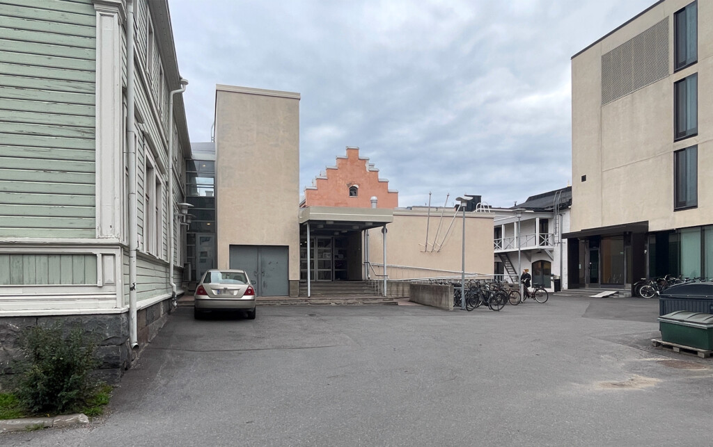
The Aleksinkulma Community Centre consists of three parts: wooden and stone buildings built in the 19th century are connected by an extension built in the 1970s. The whole no longer meets today’s technical or operational requirements. The 1970s stone extension is set to be demolished and replaced with a new one. The 19th century buildings are listed.
Location
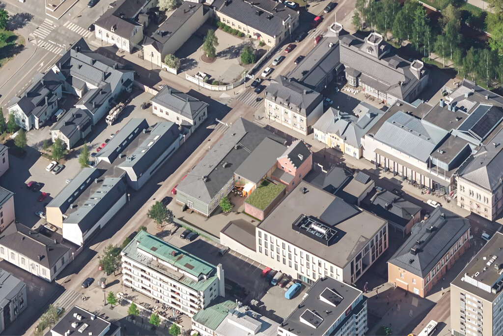
The competition area is located in the centre of Oulu, at the corner of Aleksanterinkatu and Hallituskatu. The City of Oulu’s bureau and service centre Oulu10 is also located on the same compact plot, and its maintenance and parking traffic circulates in the same yard as that of Aleksinkulma.
Solution
Aleksinkulma is a community centre, where the threshold should be low, both symbolically and concretely. In addition to accessibility, the user groups emphasise the need for clear navigation. Our solution will therefore transform the architecture of the building to better reflect its communal and inclusive character.

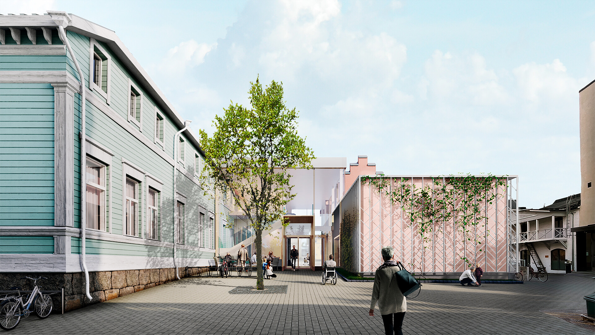
To get to the lobby, one no longer has to ascend a long ramp, but the main entrance is brought down to ground level by local landscaping. A pleasant sun-facing people’s courtyard will be created at the entrance, separated from service traffic, lightly but clearly, with bicycle racks and a courtyard-dividing tree.
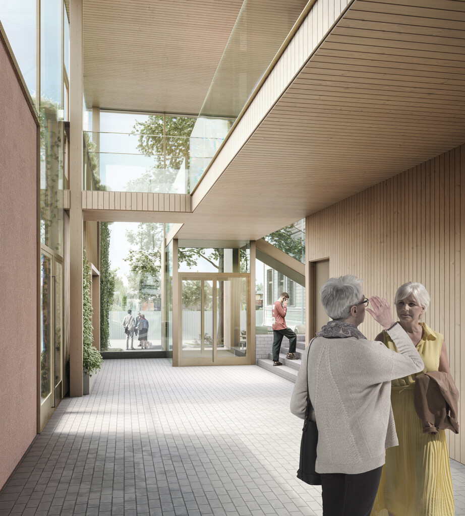
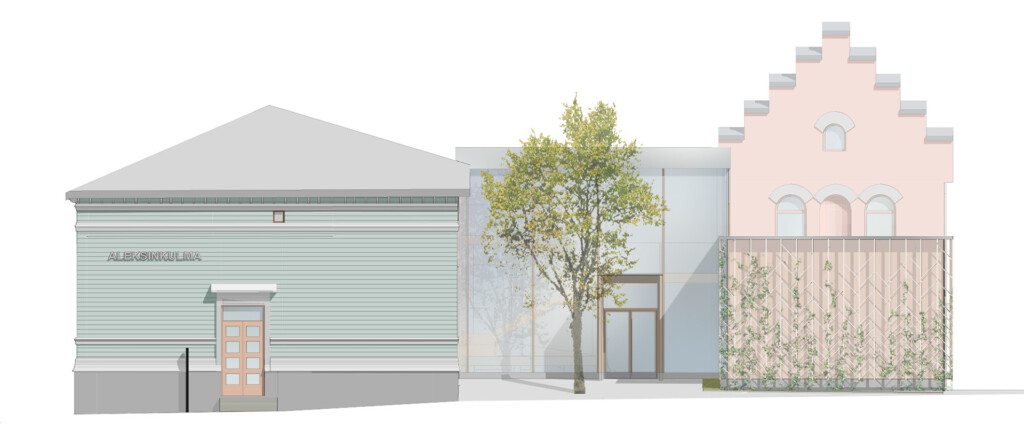
The lobby is bright and open thanks to large glass surfaces, the opposite of the current situation in terms of transparency. The main objective is a solution as clear and accessible as possible for users. Both the info booth and the lift connecting all levels are visible from the moment one enters the building. The centrally placed walk-through lift renders the ramps, which are difficult to use, redundant.
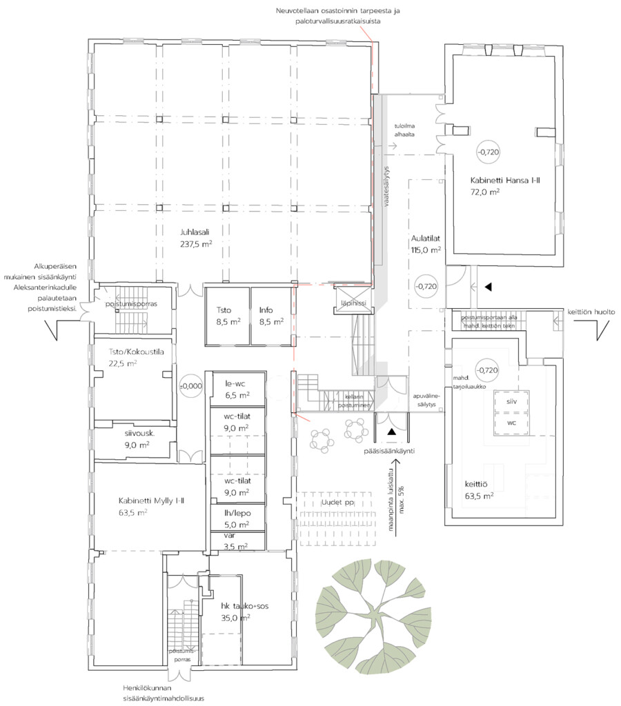
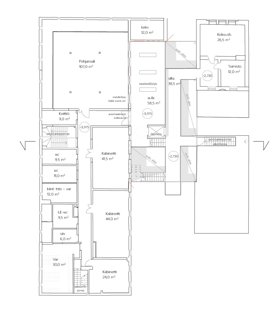
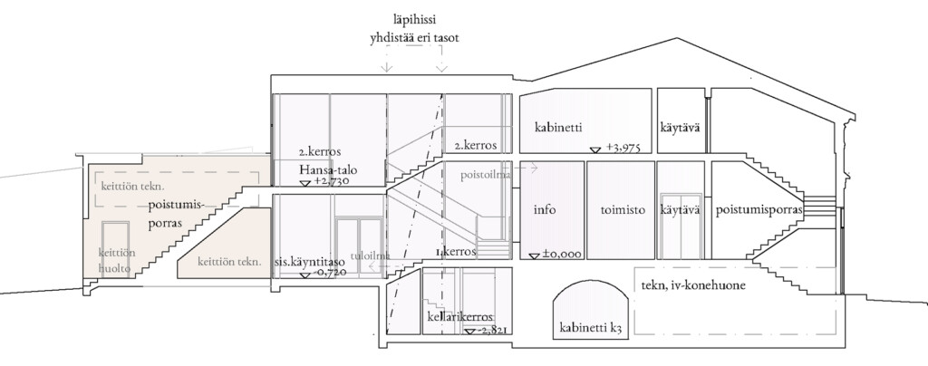
In terms of cityscape, the solution respects the listed buildings, leaving their characteristics and original boundaries well exposed. The new building does not engulf the old ones as the 1970s solution did.
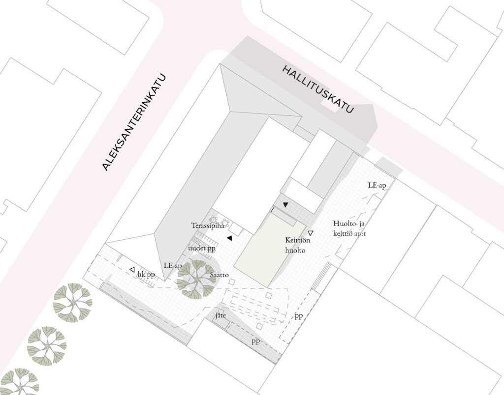
A new kitchen is set to be built in a separate extension for easy service access. It will be made of honeycomb construction blocks in solid construction and plastered in the same colour as the Hanseatic house. The kitchen requires a lot of solid wall space, providing a natural starting point for cladding the building with a beautiful trellis and climbing plants that will add greenery to the compact block.
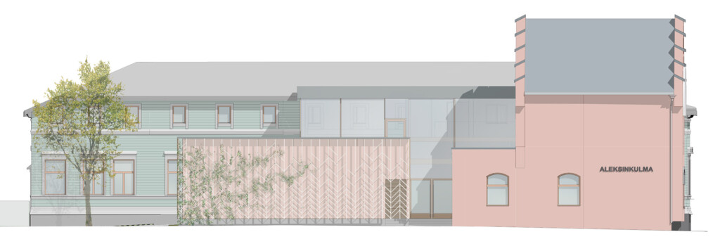
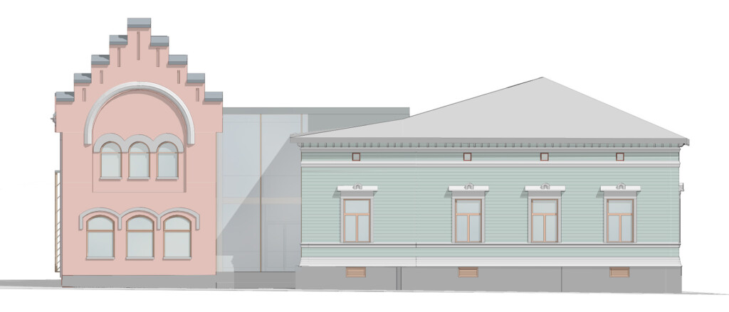
In turn, the load-bearing structures in the lobby are made of wood and the new solid surfaces are wood-cladded. The building materials of the new parts are therefore an echo of the wood and plastered brick of the listed parts of the block, creating a coherent whole.
*visualisations LUO Architects + MISTO 3D
